


PROJECT: "PHOENIX" FOOTBALL CLUB LOGO DESIGN
Logo Concept:
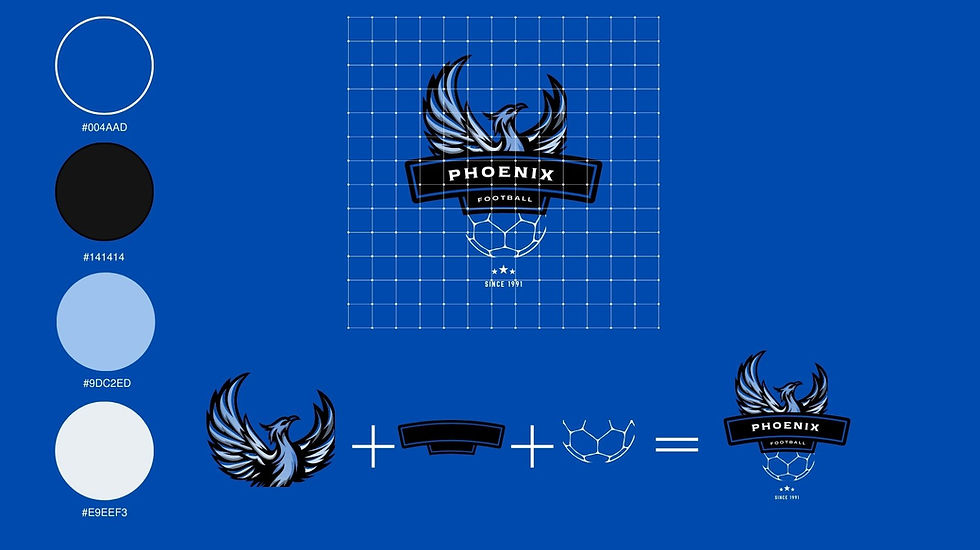
The Phoenix football club logo is a powerful representation of the mythical bird rising from the ashes, symbolizing resilience, renewal, and the team's indomitable spirit.
Color Palette:
-
-
Deep Blue:
-
The primary color is deep blue, symbolizing stability, depth, and a sense of trust. It forms the base of the logo, representing the foundation of the team.
-
Sky Blue:
-
Sky blue as a secondary color to add a touch of vibrancy, optimism, and a connection to the open sky.
-
Black:
-
Use of black for outlining and detailing to add contrast and sophistication. It helps define the edges of the design elements, making them stand out.
-
White:
-
White as a neutral color for background elements to enhance details. Adding clarity and complementing the overall color scheme.
-
Typography:
Maintaining a bold and dynamic font for the team name "PHOENIX." Ensuring the font color contrasts well with the deep black background for maximum readability.
Icon/Graphic Element:
Stylized chef's hat as the main icon. This iconic symbol immediately communicates the culinary theme and the central role of the chef in the restaurant. The chef's hat is designed with clean lines and a contemporary feel to align with the modern aspect of the restaurant.
Details and Symbolism:
-
Phoenix Rising:
-
The phoenix with its wings outstretched, using a combination of deep blue and sky blue. The transition between these two shades symbolizes the journey from depth to height.
-
Soccer Ball and Flames:
-
Soccer ball with subtle outlines creating a visually slick dynamic effect. This emphasizes the team's focus and alignment with the game.
-
Circular Frame:
-
Soccer ball, within a circular frame. The frame is outlined in white, providing a clean and cohesive structure to the logo.
Layout and Composition:
Creating a balanced and visually striking layout, ensuring that the elements are well-proportioned and easily recognizable.
Overall Impression:
The final Phoenix football club logo leaves a lasting impression of a team that rises above challenges, embodying strength, determination, and a commitment to success. The design conveys a sense of excitement and pride, resonating with both players and fans as a symbol of resilience and triumph.